Bitcoin Charts: The Ultimate Emotional Workout
If you’ve ever glanced at a Bitcoin price chart, you might have felt your soul levitate and then plummet in the span of three seconds. Tracking Bitcoin is less about numbers and more about a daily cardio routine for your emotions. Forget jogging or yoga; a simple glance at BTC/USD can raise your heart rate faster than any fitness app.
The Rise and Fall: Paddleboats and Yachts
Imagine this: yesterday, your Bitcoin was worth enough to buy a small yacht—or at least a paddleboat with some ambition. You sip your coffee, smugly thinking about all the Lambos you’re not buying yet. Then, five minutes later, the chart plunges so dramatically that your paddleboat dreams are replaced with a strong desire to hug your couch. Congratulations, you’ve just experienced Bitcoin’s version of emotional turbulence.
Candlesticks, Gremlins, and Superhero Dreams
Charts are a strange combination of modern art and psychological torture. The green candlesticks make you feel invincible, like a cryptocurrency superhero. You imagine yourself in a cape, soaring through digital blocks. Then the red candlesticks appear like mischievous gremlins, tossing your cape into a virtual trash compactor. The lines zigzag, hop, and occasionally do a little dance that says, “Surprise! You’re broke again.”
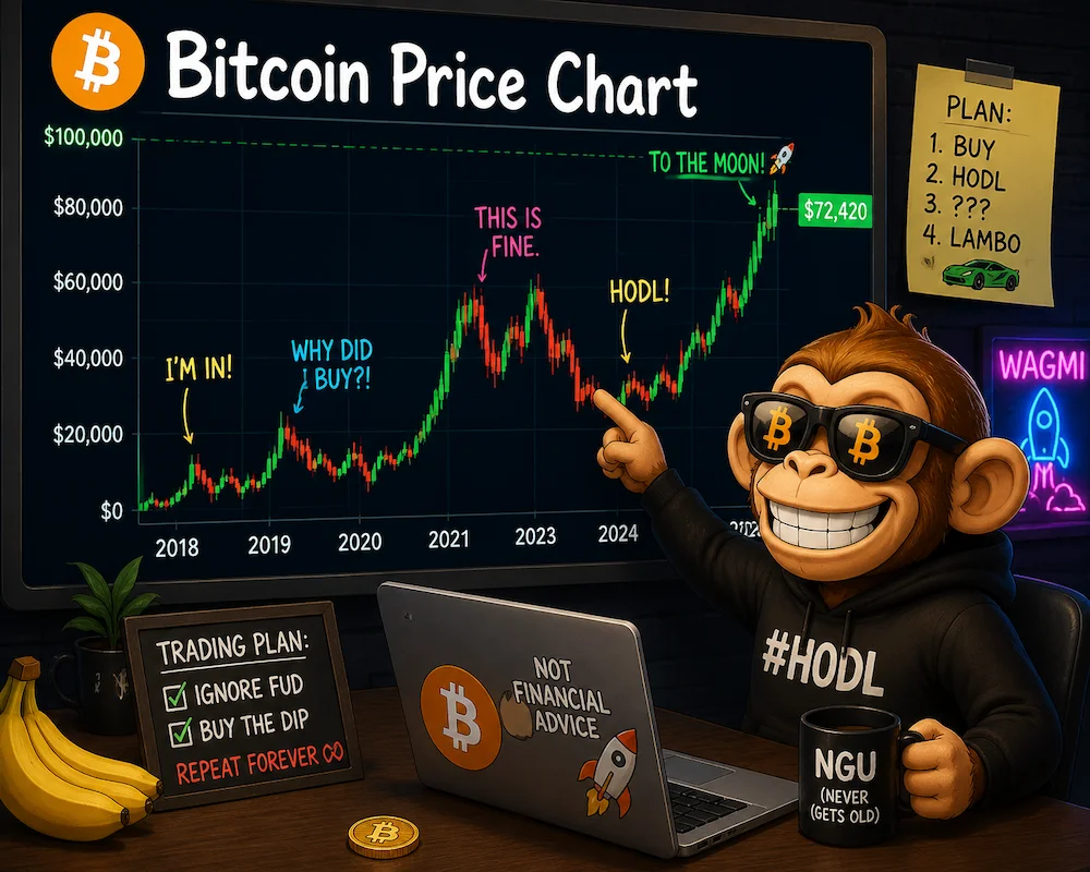
HODL or Cry: The Trader’s Dilemma
Analysts will tell you to “HODL” or “buy the dip.” But when the dip looks like it fell off the Empire State Building, even seasoned HODLers begin questioning life choices. Some brave souls start creating imaginary spreadsheets to convince themselves that Bitcoin’s temporary crash is actually a secret long-term strategy. Others simply post crying emojis on Twitter. Both are valid coping mechanisms.
Predictive Charts: When Arrows Lie
Every platform has a “predictive” chart. They show curves and trends, sometimes with arrows pointing skyward, as if Bitcoin itself is gently whispering, “Relax, I’ve got this.” Then reality intervenes. Those same charts often end up looking like a toddler’s scribbles after a sugar rush—chaotic, colorful, and completely unpredictable.
Lessons from the Digital Rollercoaster
At the end of the day, the Bitcoin price chart teaches us an important lesson: life is volatile, funny, and occasionally terrifying. Just like your portfolio. And while you may not buy that Lambo today, tomorrow’s chart might give you hope—or at least a good laugh. So pour another coffee, grab your favorite snack, and watch the digital rollercoaster continue. Because in the world of Bitcoin, every chart tells a story, and every story is hilariously unpredictable.
FAQ
Q1: Why does my Bitcoin chart look like a rollercoaster?
A1: Because Bitcoin has a flair for drama. One minute it soars, the next it dives, and your emotions ride along for free.
Q2: Should I panic when the chart drops?
A2: Not necessarily. Panicking is optional, but crying emojis on Twitter are encouraged.
Q3: Can I really predict Bitcoin with charts?
A3: Only if you’re psychic—or a toddler with crayons. Otherwise, enjoy the unpredictable fun.
Q4: How can I survive Bitcoin volatility?
A4: Coffee, snacks, humor, and HODL. Repeat as needed.